A business logo is the symbol identification of a brand. It is a recognition that a brand holds in the market even without using its name. A logo is a blend of various components that plays a vital role in building a professional reputation of a brand. It consists of colour, typography, image, tagline etc. Some of the quintessential logos are from Twitter, Apple, McDonald’s etc.
Why do brands need a logo?
Now the question arises, why is it important for a brand to have a logo? Well, to begin with, a logo is the foremost impression that a brand casts out. The logo on handbags, app icon, banner, store highlight, everything in unanimity is an initial step towards professionalism. This step of consistency leads to the following :
It makes a brand recognized,
It stimulates brand loyalty,
It builds trust and emotional connection with its customers.
What are the best practices for effective logo designing?
Any brand can mix and match some colours and fonts to prepare its logo, but what about creating a logo that leaves a long-lasting impact? To accomplish this task, a brand needs to take care of the following with the utmost skills:
A logo should be such that the brand stands out amongst its competitors. It must be unique.
The logo should be used strategically.
It is recommended to have a simple design of a logo with subtle colours. Complex logos often go out of attention
A designer should make their logo versatile and scalable so that it fits every backdrop and fulfills every purpose.
Their design should be planned in such a manner that it leaves a long-lasting impression on the mind of the customer. It should be memorised easily.
Why do you need to revamp your logo?
A brand that aims to continue its legacy for years, needs to be flexible. As the time changes, so do the likes and dislikes of their customers. To sustain, a brand should understand that they need to adapt as per the market situations. Hence, a logo once loved by their customers might not make any sense to their new customers resulting in direct financial impact. There could possibly be the following reasons why revamping a logo is essential –
Logo is too outdated to resonate with
It is complex to understand
It wasn’t made apt initially
Factor of uniqueness is lacking
Unscalability
Some of the big brands addressed this concern of revamping their logos due to one or the other reasons, and these are some of the best examples of logo revamping:
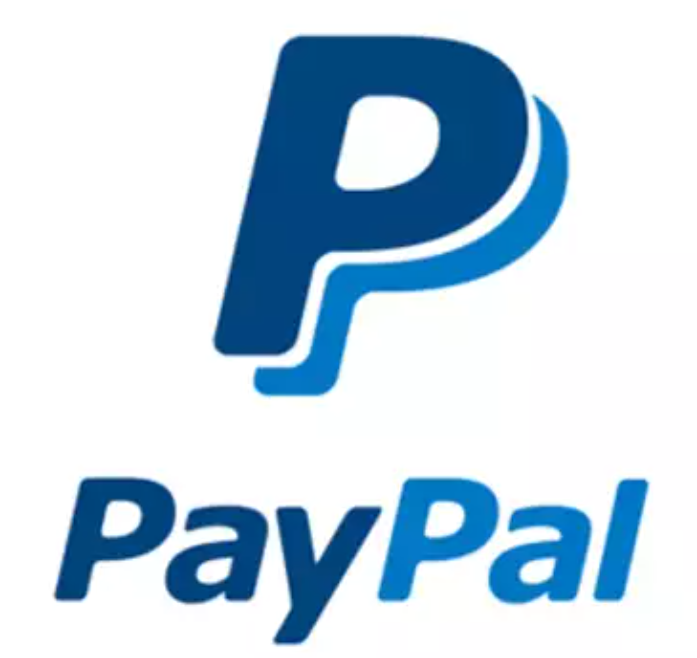
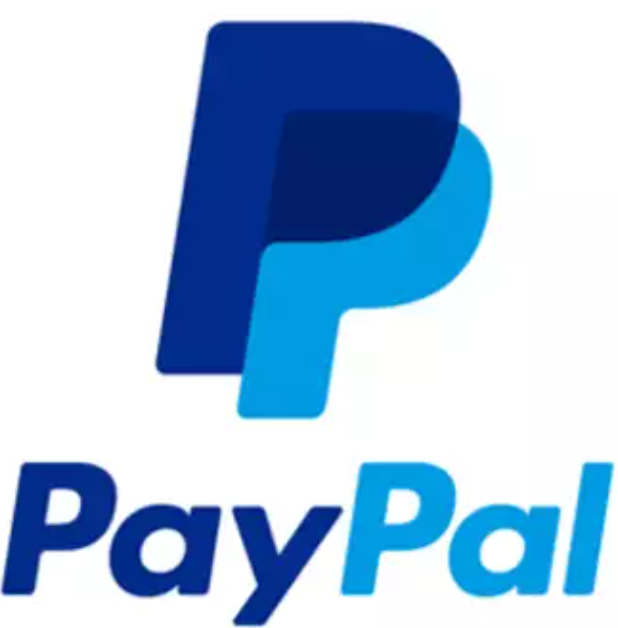
Considering the rise of mobile technologies, PayPal revamped their logo in 2014, which continues to be the most successful logo introduced by PayPal so far. The strengthened italics and overlapping double P in the monogram beautifully reflect the key themes of PayPal’s identity, i.e. forwardness and connection respectively.
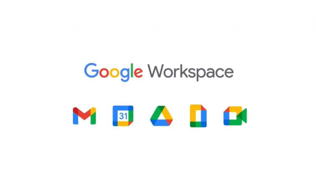
To maintain the consistency, google has chosen four colors and revamped its entire set of logos using the same. From the brand’s perspective a great thought, but we guess people aren’t very comfortable with the change.
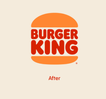
Burger King had kept in mind the concept of maximum wavelength. Hence, they picked up red to write their brand name. But earlier, the buns of the burger weren’t very poppy as they are now. The name written as Burger King seems like two slices of patty covered with bun. New logo is a best example of an exact blend of colors defining the business.
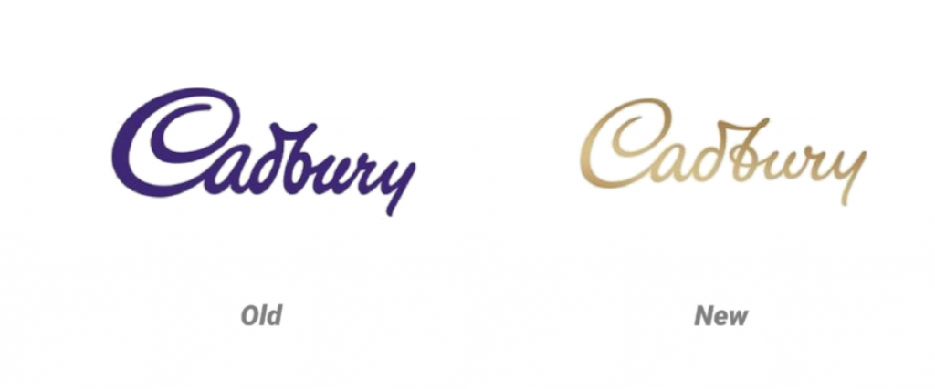
To justify the business, has Cadbury decided to look more chocolaty? That’s what the choice of their logo color tells us. Different shades of brown are giving a more stylish look to the logo.
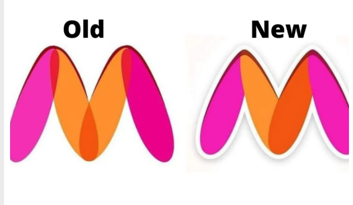
One of the most controversial logo of 2021 so far. Could anyone every imagine it as the legs of a woman spread apart until someone decided to get offended about that? Myntra made the only changes required depicting that the brand itself had no plans of revamping the logo.
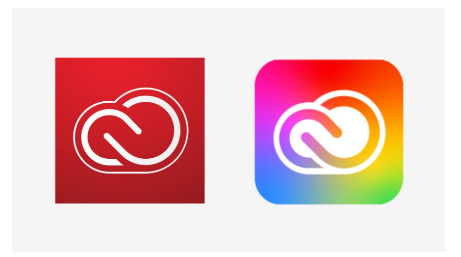
Adobe is a computer software company providing various solutions related to content creation & digital marketing is renowned for its quality. Since, the brand is spreading its roots in the world of digital media, how could one single color define that purpose. What about a color palette? Any sort of help needed, Adobe, who else?
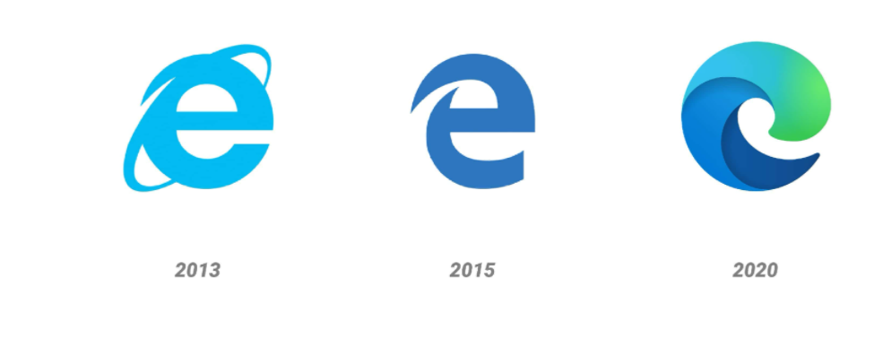
Referred to as “the most significant change”, this new logo of Microsoft Edge browser is an amazing blend of colors and art.
From the cool funky logo, GoDaddy has become simpler with its logo. The letter G and O intertwined in heart-shape with a simpler and bold font makes the logo looks more classy.
We’ve seen some of the best-revamped logo designs till date. However, when you are trying to figure out if you should change your logo, you should also consider the points as to why you don’t need to change your logo designs.
Why should you not revamp your logo?
As already discussed a logo is a symbol identity of a brand and revamping a logo means, changing your identity. This is a risky game and it can backfire any time. Here are the reasons why a brand shouldn’t redesign their logo:
Your customers are happy with your logo.
It clearly fits all the requirements of a good logo, i.e., subtle colors, fonts, design, everything.
It defines who you are and it represents your brand effectively.
Now that you are pretty much aware of the concept of logo redesigning and how to go ahead with it, we encourage you to give it a thought before you proceed with the process of revamping one of the crucial elements of brand identity- your business logo.
At Wheezart, we assess your brand completely to help you decide whether it would be beneficial for your brand to undergo the process of re-branding or not. If yes, we make sure to re-design everything in such a way that your customers can still recognize your brand and connect even better with the brand message and emotion. Branding is a perception, we make sure that your audience perceives your brand just like the way you want it to be.


Recent Comments